Friday, October 27, 2006

Oh, this is a cool map! People have such great ideas. I really like the transparency of the dots. The dots overlap but you can still see beneath them to where they belong. It's all done in grays and white and it is striking.
For my final project I will be mapping data on Europe and this has definately given me a few ideas.
I nearly forgot to say where this came from...I did a search at Yahoo Images and here is the url for the map: http://www.d.umn.edu/geog/cartfolder/HTML%20Pages/Prop-Symbol2.htm.
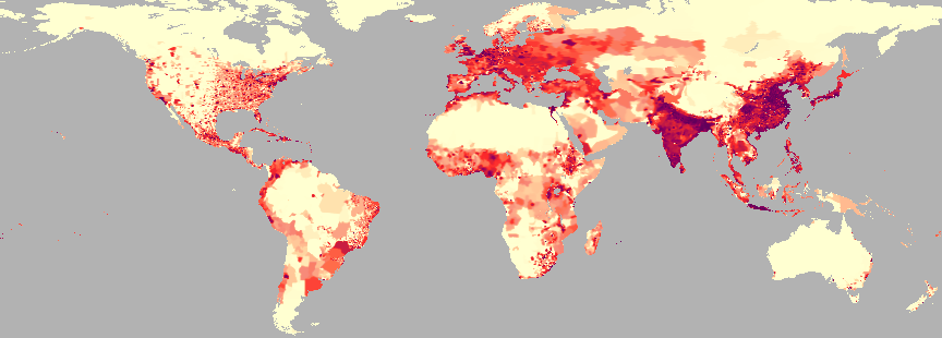
This is a dot density map of world population that I found at ReliefWeb (http://www.reliefweb.int/mapc/world/wgppycpd.html) which is somehow related to the UN.
I thought this was a cool map because the colors in it are translucent, it almost does look like the urban areas are bleeding into the rural areas. The gray chosen in the background makes this map, at least to me, look almost like a remote sensing photo. The contrast is very good, it's easy to see what's going on in the map. It's a beautiful map with a fatal flaw.
There is no legend. That is a big mistake, I have no idea how big the dot is. I was surprised that a place as reputable as the UN would make such a mistake. Oh well, it's still a neat map to look at.
Monday, October 23, 2006
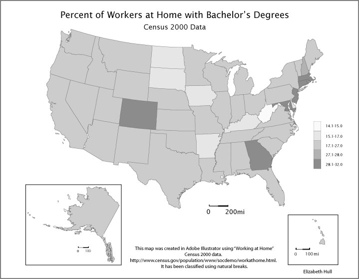
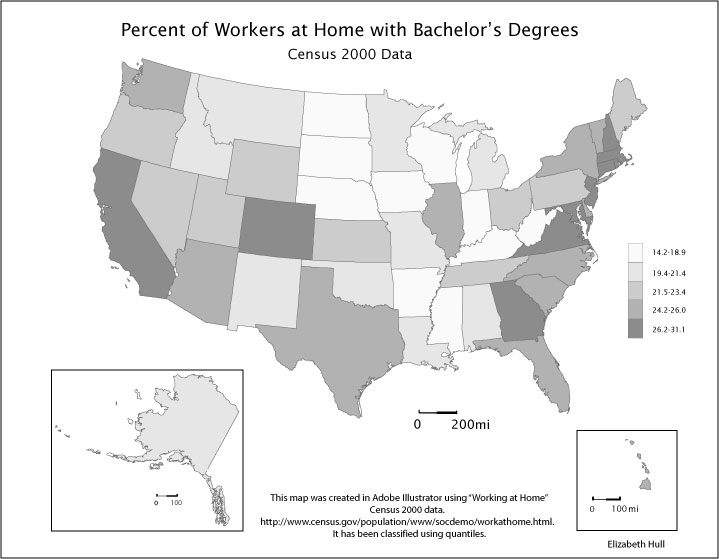
For Lab 5 I chose to map The Percentage of Workers at Home with Bachelor’s degrees for all fifty states, http://www.census.gov/population/www/socdemo/workathome.html. True to form, natural breaks produced a map that was largely homogenous thereby emphasizing the outliers in the data. For the second map, I thought it would be useful to see more of the distribution in the data so I chose quantiles, specifically quintiles.
The difference in the maps is quite noticeable. (Map1-Natural Breaks appears on top, Map 2-Quintiles appears on bottom. Clicking on the map will produce a larger view.) In Map 1, classified by natural breaks, West Virginia stands alone as the lowest number of people who work at home with bachelor’s degrees. The North-East corridor, Colorado, and Georgia stand out as the states with the highest percentage of people who work at home and have bachelor’s degrees. New Hampshire, which is ranked in the fourth class, is barely noticeable. The entire rest of the country looks basically the same. A pattern doesn’t seem evident, unless it’s that rural areas tend not to have college educated people working at home.
Map 2 shows more detail of the geographic pattern that begins to emerge in Map 1. From this map it becomes possible to hypothesize on possible reasons for the distribution of the data. For example, the inclusion of California in class 5 and Texas, Florida, Illinois, and the Carolina’s in class 4 leads me to ask: is it possible that more educated workers work at home in large traffic congested cities? Many more questions come to mind as I look at Map 2. Map 1 is useful if I want to see how much of the country falls into the bell shape of the curve of this data and where the outliers are to be found. In order to get a better idea of the actual distribution quintiles were more useful.
Tuesday, October 17, 2006

Here is Lab 4. It is a map that I replicated of Harpers Ferry National Historical Park. The fonts on this one were tough to replicate. The original was clear and well defined, I hope mine will be readable in this format. I chose to put it up here as large as it would go to give the readers eye a fighting chance. If you click on the map you will get a slightly larger view of the map by itself. (I have kept the pictures small on this sight in order to make loading the blog easier, especially for those of us still using dial-up connections.)
It really is amazing the amount of detail that goes into these maps. By detail I mean the attention to detail of the map maker. The fonts and placing of text are not mistakes but carefully chosen map elements. I am not really sure that I thought about it in this way before.
![]()