Friday, October 27, 2006
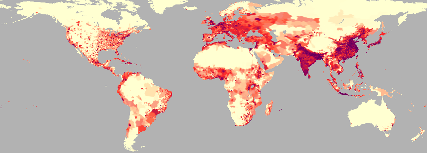
This is a dot density map of world population that I found at ReliefWeb (http://www.reliefweb.int/mapc/world/wgppycpd.html) which is somehow related to the UN.
I thought this was a cool map because the colors in it are translucent, it almost does look like the urban areas are bleeding into the rural areas. The gray chosen in the background makes this map, at least to me, look almost like a remote sensing photo. The contrast is very good, it's easy to see what's going on in the map. It's a beautiful map with a fatal flaw.
There is no legend. That is a big mistake, I have no idea how big the dot is. I was surprised that a place as reputable as the UN would make such a mistake. Oh well, it's still a neat map to look at.
// posted by Elizabeth Hull @ 12:04 PM 
![]()