Tuesday, November 28, 2006
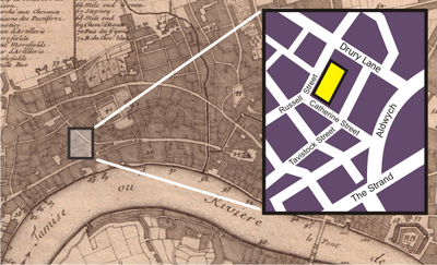
www.answers.com/topic/theatre-royal-drury-lane This is the website for this cool map. It is an inset map for the location of the Drury Theatre in London. (I wonder where the Muffin Man's shoppe is?) I think this is cool because it shows a map of 1700 London with a 2006 inset.
What a great way to combine the info for a tourist/history buff.
Sunday, November 26, 2006

A rearview mirror gives a birds-eye view of the commute times in North Carolina. Check your guages for directions!
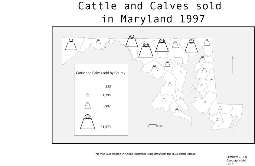
I had a blast making this map. At first I thought I would use a clock and do proportional symbols, oh the ideas were flowing. But since this was mean data, I thought the choropleth style made the most sense.
I adjusted a color borrowed from ColorBrewer (www.colorbrewer.org) to use as the background color. I think it makes a nice contrast to the purples in the map, it also has a certain beachy feel which I like.
I think I should say that this is mean data. So the choropleth is legal. I made switch in the printed version which I will turn in.
Monday, November 20, 2006
By the time I was able to get there it was after 2 pm and the presentations were already going on, but out in the common area the vendors were still showing their wares. SAIC had some beautiful littoral maps on display. The area around Staten Island had been chosen, I guess it was really New York Harbor, but I used to live in Staten Island so I focused on the land part. The detail in the map was amazing. There was so much displayed from depths to shipping lanes. The guys behind the display said that they were ESRI based products. That’s wild because none of my ArcView maps look that good. I wished I had asked them how many layers were represented in the map.
The Northrup Grumman folks had a cool display of a chemical spill. It was a dynamic
3-D map. It was not easy to tell where it was, the representative told me it went from Richmond to DC. It didn’t look like it to me, but that’s ok, the thing was still a powerful example of 3-D modeling. There was a crowd around a huge touch screen display that was being demonstrated by another N-G rep that I never did get to see. The crowd was too big and I ran out of time.
The City of Fairfax had a table as well. I thought that was great because that historical website was used in the Geography of Virginia and was a great resource.
All in all it was a good event, although it was rather small. I am glad I went.
Monday, November 13, 2006

This is a cool map of temperatures in Albany. http://www.albany.edu/~msz03/test/albany_temp.gif is where you can see the original. Each cell is a record of the average temperature in Albany. What a great way to represent the data. It goes back for years. The pattern, though not a surprise, is well documented in this format. I am not sure that it is a choropleth map in the way that they have been defined in this class, (this is not a representation of the town of Albany) but the color is used in the same way to represent values and the pattern is very clear. It's a hybrid-type thing maybe. Although, when intelligent, creative people are working it's hard to say what will happen to old definitions.
Saturday, November 11, 2006

I have had such fun with this lab. ColorBrewer is a powerful tool that I expect to use a lot. http://ColorBrewer.org.
The colors on this map allow the data to pop out much stronger than that grayscale map I made earlier of the same data. In print the colors are much more vibrant than they are here. Which I think is too bad. The difference in the darker colors are really the addition of warm tones to the darkest color which separates it from the number 4 catagory.
Tuesday, November 07, 2006

From now on, any time I see a dot map I will slow down and really take a look. It's the least I can do to pay homage to the hours it takes to place individual tiny dots on a map.
This map presented a number of challenges, in particular the number of dots to use and the size to choose. The number was important because I was not mapping an entire population, only about 2 percent- the veterans. I was concerned that if I chose to have one dot represent 100 veterans the state would look overrun with vets. So I chose to make one dot represent 200 vets, this puts a little over 1000 dots on the map. As for size I had the same problem, I did not want them to be too big because the pattern wouldn't show up, but then if it's too small it would look like there is more accuracy in the map then there actually is-I do not have actual addresses to place all these vets. I finally decided on this size because it is an inbetween size that adequately represents the vets but doesn't look too accurate.
I placed the dots geographically. It makes sense that clustering of this sample of the population would follow the distribution of the larger population so that is where I placed the majority of the dots. According to my atlas, many of the outlying towns have small populations of 200-300 people or so. When I ran across 3 or so towns like that I would place a dot in that vicinity trying to weight it toward the town with the largest population.
Lab 6 was fun. I am not an artisit, but I think those symbols look enought like cowbells that no one will be confused. It was tough to get the first symbol actually small enough but once I did it was smooth sailing from there.
![]()