Monday, February 26, 2007

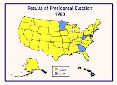
For Lab 3 I mapped the 1980 presidential election. I was sixteen years old and it was the first time that I was really aware of what was going on. I chose a yellow color scheme because for me it was a yellow election. That year, 1979-80, was the year of the “Iranian Hostage Crisis”. 52 American hostages were being held in Tehran and Ronald Reagan promised to get them released. That year, for the first time, yellow ribbons appeared tied to telephone poles and streets signs. The image was taken from a song that had recently been popular called “Tie a Yellow Ribbon” (much like “I’m proud to be an American” came out again after 9/11) and it signified the desire of the American people to have their people returned. The day that Reagan was inaugurated the hostages were freed. Anytime I think of that election I see yellow.
Monday, February 12, 2007
Ok, these maps and cartograms will look familiar to anyone who took Geog 110 at the same time I did. These maps are done by the same people that made the cartogram that Dr. Kronenfeld used to demonstrate cartograms. Election Result 2006 Maps starts with a general choropleth style map showing red and blue areas and then they show cartograms from the same data. They are beautifully done. Of course it is hard to see Virginia etc, but contrasts in the map say a great deal about the political distribution nonetheless. Good descriptions accompany each map so I will not try to recap it here.

 The top view is a June 2004 image of part of the island of Sumatra, Indonesia. The second image was taken in December 2004 after the devastating sunami. It is clear in these photos just how devestating.
 I outlined the shoreline in blue first and then the bridges in pink and I thought that the image could use more depth. I added the roads to give that depth, I then added the farm area layer thinking it would be useful to see where those farm fields were. It is stunning how much of this area is submerged.
Monday, February 05, 2007


For Lab 1 I chose to map the percentage of people who work at home vice those who work outside of the home. I found it interesting that most of the states are pretty equal in these percentages. I expected that more people would be working outside of their homes. In fact the numbers were so close that I was able to use the same classification scheme for both maps. They are classified by equal area based on range.
I was concerned about continuity in the maps. The first two are exactly the same. But I found the font for the numbers was too large and busy for the final map. Rather than switch the fonts in the first two maps, I left them because I found the overall effect of the font on the maps pleasing and I don't think it is too much of a challenge to read. I chose this font, even though it is a little "curly-que" because my concept of the map was of something whimsical. Probably because intially I was thinking of those who work at home; I think that working at home gives people the opportunity to express themselves in a way that is not always available to the work-a-day world. The final map is more complex, particularly the legend. So I changed the font of the numbers to increase simplicity and it allowed me to reduce the size so that the legend would fit in the space on the map. Everything else is exactly the same.
I was concerned about continuity in the maps. The first two are exactly the same. But I found the font for the numbers was too large and busy for the final map. Rather than switch the fonts in the first two maps, I left them because I found the overall effect of the font on the maps pleasing and I don't think it is too much of a challenge to read. I chose this font, even though it is a little "curly-que" because my concept of the map was of something whimsical. Probably because intially I was thinking of those who work at home; I think that working at home gives people the opportunity to express themselves in a way that is not always available to the work-a-day world. The final map is more complex, particularly the legend. So I changed the font of the numbers to increase simplicity and it allowed me to reduce the size so that the legend would fit in the space on the map. Everything else is exactly the same.
The colors in the legend in the bivariate map were challenging as well. I found these colors by playing with the swatch maker. I chose pink/purple and green for the map so that the middle ground wouldn't have to be gray. The final colors though are grayed and sort of muddied. It gives the whole map a muddy feel to me. I don't like that very much, I prefer clear tones, but I don't see how you can do that in this type of map, with the colors in the legend needing to blend the way they do. Perhaps if I had fiddled around longer I would have come up with something more pleasing to my eye. I do think that the colors are distinguishable from one another which is more important than my liking of the colors so I went with them.